Summary
- The U.S. does indeed have the most expensive healthcare system in the world (in absolute terms, as a percentage of GDP, and per Capita)
- The U.S. does not, however, have the highest out-of-pocket expenses for healthcare (Singapore and Switzerland are two counter-examples)
- In the U.S., most of the healthcare expenditure is comprised of: hospital costs, physician and clinical services, and prescription drugs
- Of those three cost factors, prescription drug expenses are rising the fastest (from 2000 - 2014, 146% increase)
- Of those three cost factors, hospital costs have risen the most over the 2000 - 2014 time frame ($556 billion)
Introduction
It should come as no surprise to you, as this information has been publicized all over the news and online information outlets, that the United States has the most expensive Healthcare system in the world.Now - I'm going to try my best to avoid opinion and speculation for this article, and as such, I'm not going to talk about why the U.S. has the most expensive healthcare system in the world. That issue is the topic of much debate, and I have not yet compiled enough data to write that series of articles.
Instead - I'm going to breakdown the costs of the U.S. Healthcare system. Let's start with analyzing the claim: "the United States has the most expensive Healthcare system in the world"?
Warning: This article is data heavy and opinion light!
Does the United States really have the most expensive Healthcare system in the world?
To address this question, we need a better definition of what "most expensive" really means. Before we get there, let us tackle a few definitions:- Gross Domestic Product (GDP) - Investing Answers defines GDP as: "(GDP) is the broadest quantitative measure of a nation's total economic activity. More specifically, GDP represents the monetary value of all goods and services produced within a nation's geographic borders over a specified period of time."
- Purchasing Power Parity (PPP) or International Dollars (Int$) - When comparing prices, income, and other financial quantities between countries, it is common to convert all prices to a common currency (the "reserve currency" - U.S. dollars - is a common choice). There is a problem with this approach though, as it doesn't take into account "purchasing power" (or more specifically, currency exchange rate differences) between two currencies. Purchasing Power Parity is a way to compare not only prices between two currencies, but also compare "buying power" or "equivalent purchasable goods/services" between two different currency amounts.
- Measurements "per Capita" - When talking about quantities "per Capita", this simply means: "given quantity X, the 'quantity X per Capita' is that quantity X, divided by the total population of a given region or area." Here, we will be talking about country populations when using "per Capita".
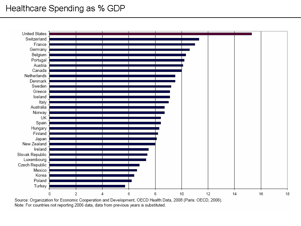
Typically - political pundits, news outlets, and information sites are referring to a countries "healthcare costs as a percentage of GDP" when they make this claim. In other words, the fraction of the total goods and services produced which relate to healthcare expenditure. Some of you may have seen this chart before:
Instead of looking at simply the percentage of economic activity that relates to healthcare expenditure, perhaps we should also ask:
- What is the total healthcare expenditure in $USD (adjusted for PPP)?
- What is the "individual burden" of healthcare costs on each countries' citizens?
- How much are people in those countries paying "out-of-pocket" for healthcare?
- What is the U.S. spending all those healthcare dollars on?
I've compiled data from the OECD database and WorldBank database to answer these questions (using more up-to-date data than in the above chart). The countries compared below are a different set than those in the above chart, because more up-to-date relevant statistical data were not available for every country in the original chart.
Let's tackle that first question: "what is the total healthcare expenditure in U.S. dollars, adjusted for purchasing power parity?" This table shows those data (based on 2014 numbers):

Clearly, the United States spends the most money on healthcare, by quite a significant margin.
Many of you might be thinking "OK, but that makes sense, because the United States has a much larger population than any of those other countries." Which brings us to the second question "What is the 'individual burden' of healthcare costs on each countries' citizens?"
In order to answer that question, I'm going to rephrase it slightly and make it more precise. If we instead ask "If the total cost of healthcare were spread equally over all the citizens in that country ("per Capita"), what would each person's financial responsibility be?"
Said another way - "if instead of how things are today, everyone in that country were to receive a yearly bill for healthcare, how much would each person be responsible for paying?" Hopefully you will agree with me that the second phrasing encompasses the intent of the first phrasing. Let's look at those data:

These data take into account the U.S. has a much larger population than any of the other sample countries in the data-set (7.81x larger than average). So looking at this, we can see that even if you adjust for population size, the "individual burden" of healthcare costs (per person or "per Capita") in purchasing power parity $USD is still the highest in the United States.
It is reasonable to say at this point that while the United States has the highest healthcare expenditure per Capita, people in all of the sample countries do not get yearly bills for healthcare. Every country in the data-set, including the U.S., does some sort of "cost-sharing" of healthcare expenditure. Briefly, "cost-sharing" in relation to healthcare is the amount that the individual patient is responsible for paying out-of-pocket, after government, insurance, and other private party payments have been made.
These data best capture the individual cost of "healthcare utility" or said another way "represent the individual cost of using healthcare" in each of the sample countries. The following chart shows those data:

Specifically, what these data show is "if the total amount paid out-of-pocket each year were spread over all the people in those countries, how much each person would be responsible for paying". Now, obviously this is not how any of these countries' healthcare systems work in practice, but it does give us a good idea of how much, proportionally, each countries citizens pay when they need to use healthcare.
In these data, we can see that Singapore, not the United States, has the most expensive healthcare system. Obviously in countries which do not have subsidized healthcare systems, individual out-of-pocket expenses may represent the entire cost of healthcare (India is one such example). In our sample countries, however, this is not the case. Each country in the data-set (intentionally) has some form of subsidized healthcare system (ranging from private insurance to universal single-payer).
The Netherlands is clearly the winner in this category, with an out-of-pocket per Capita expense of 3.83 times less than in the United States.
United States Healthcare Expenditure Breakdown
Finally, the last thing I wanted to examine in this article is how the U.S. spends its healthcare dollars. To answer this question, I've compiled data from CMS NHE, CDC, and OECD data tables. Firstly, lets look at a chart showing the healthcare expenditure breakdown over time (1980 - 2014):
All cost data is in 2015 US dollars. From this chart, you can see that the following categories or cost factors dominate the total U.S. healthcare cost:
- Hospital Care
- Physician and Clinical Services
- Prescription Drugs
That chart is shown below:

Each of the three major cost categories are charted against their expected values due to inflation over the same time period. I said I was going to try to avoid opinion in this article, so lets just look at what the data tell us:
- Each of the three major healthcare cost factors/categories (Hospital Care, Physician and Clinical Services, and Prescription Drugs) have risen significantly faster than inflation from 2000 - 2014
- In terms of relative increase - prescription drugs have risen the fastest (146% increase, 109% faster than inflation, which was 37% over the same period), followed by hospital costs (97% faster than inflation), with physician and clinical services rising the slowest (72% faster than inflation)
- In terms of absolute increase - hospital costs have risen $400,575 million more than predicted by inflation (predicted: $155,730 million), physician and clinical service have risen $206,718 million more than inflation, and prescription drugs have risen $131,312 million more than inflation
- Hospital costs comprise 34%
- Physician and clinical services comprise 21%
- Prescription drugs comprise 10%
- By contrast, the net cost of health insurance (premiums collected minus benefits paid) was $194 billion USD, or about 7% of the total cost
Conclusion
Hopefully you have learned something about the U.S. healthcare system from this article and that it was informative.Thanks for reading,
K. DiVincenzo
Note: Feel free to contact me (directly, not through a comment) if you would like a copy of the raw data tables used to generate the above tables and charts. I may, in the future, simply publish all the tables and charts to Google Docs, but this has not been done yet.
No comments:
Post a Comment